Global Backgrounds
Global Backgrounds are CSS backgrounds that you can use throughout your project.
They can be applied to the following elements:
- Headers (via template variables)
- Layouts (via CB layout settings)
- Footer CTAs (via template variables)
- Footers (via template variables)
- Pages (via Configuration or TVs) - Coming
soonsomeday!
Creating a Global Background
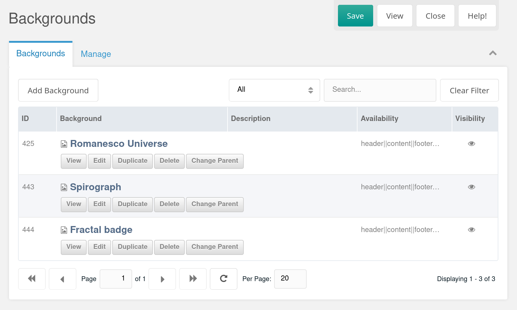
You can find the Global Backgrounds container under the Global Content context. In there, you'll see a Collections grid with the available backgrounds (if there are any). You can define where the backgrounds will be available in the dropdown selector. If you set visibility to hidden, they won't appear in any selector (but existing selections remain intact).

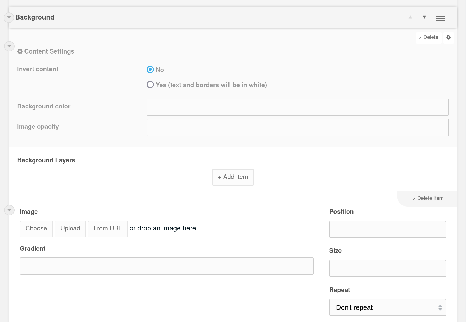
Each background is a separate MODX resource. So if you add a background from the grid, it will create a new resource for you. In the content area, you should see a ContentBlocks field named Background Layers. That's where you add your visuals.
As the name suggests, the Background Layers block can contain multiple layers. These layers are displayed on top of each other. If the top layers don't cover the entire background, the bottom layers can be seen underneath. You can use this to create layer masks (logo, pattern, wavy borders) over your image.
Each layer item has 2 input fields: image and gradient. You can only use 1 per item.

Images
An image can be a JPEG, GIF, PNG or SVG file and on the right you can adjust the CSS properties Position, Size, Repeat and Attachment if needed.
SVGs are especially useful as overlay, because they are vector-based and scale well across screen sizes, while remaining small in file size. And speaking of file size:
Be aware that adding multiple layers with images, transparent PNGs in particular, can result in substantially slower loading times.
Gradients
Gradients need to be added as CSS value, following the latest CSS3 specification. For example:
linear-gradient(to right, grey, purple)
For your orientation, this is how the value will fit in:
background: YOUR_GRADIENT_STRING !important;
So for example, gradients with multiple color stops (separated by a comma) are fine:
linear-gradient(red 0%, orange 25%, yellow 50%, green 75%, blue 100%)
See more examples on CSS Tricks and Mozilla Developers Network.
Content settings
Inverted
By default, the content elements that will be displayed on top if this background are dark. So make sure your background is light enough to read the text, or that your content is boxed in a segment or card.
If inverted is set to Yes, content elements (such as text and borders) will be colored white when displayed on top of this background.
Background color
You can add any CSS color value here (#000,rgba(0,0,0,.8),black). This color will be used for the base layer of the background. If you don't specify a color, the bottom will be transparent.
Opacity
Define transparency by adding a value between 0 and 100. Applies to the entire background.
Filter
Hidden under the Settings wheel, you can also apply a filter to your background. From MDN: the filter CSS property applies graphical effects like blur or color shift to an element.
Cool stuff, but be aware that most filters (especially blur) require heavy processing from the browser. This can cause older computers to experience some slowdown or laggy behaviour when navigating your site.
Responsive behaviour

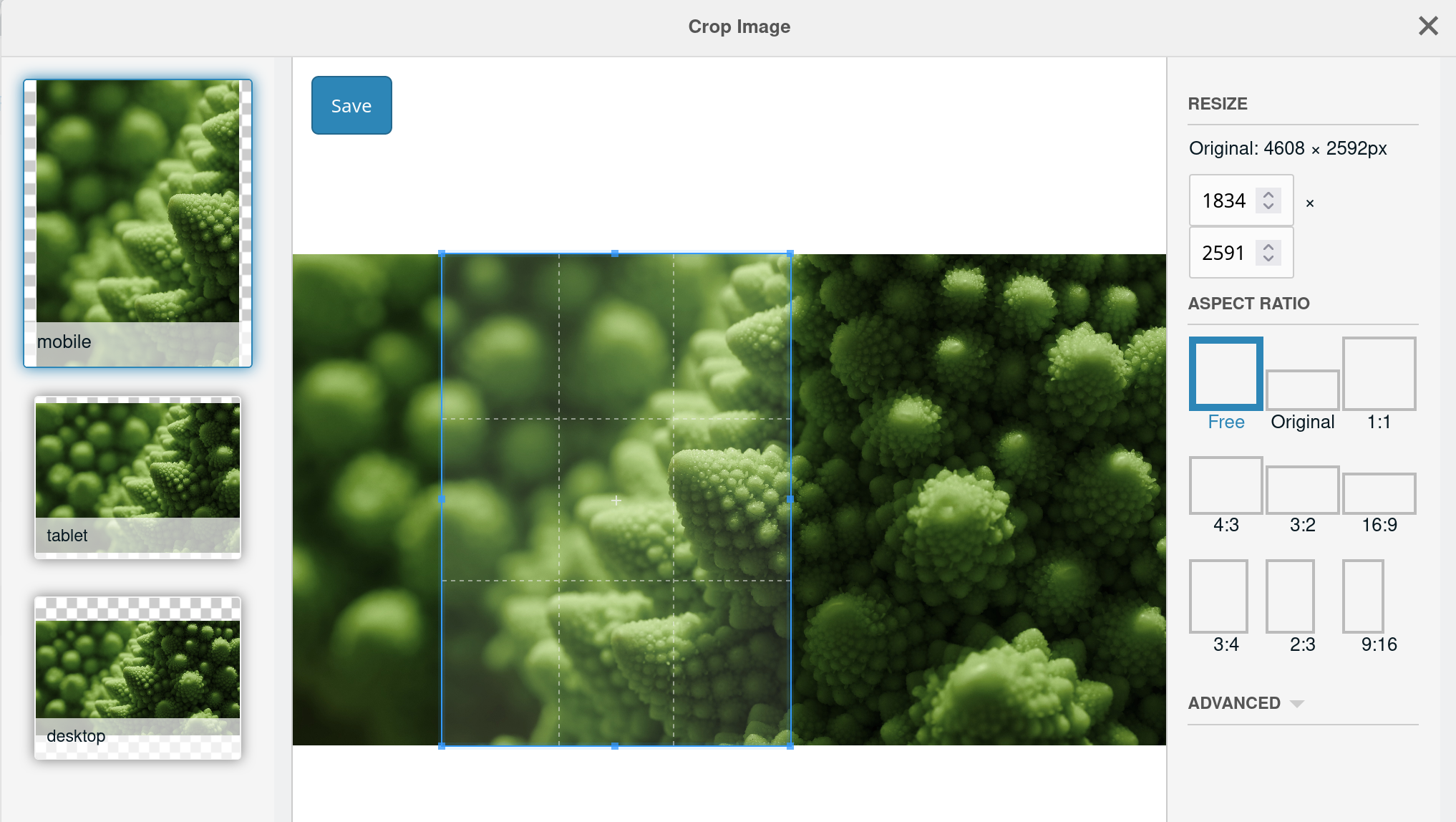
When you add an image inside a background layer, you'll be greeted by the cropping tool. In here, you can specify crops for display on mobile, tablet and desktop screens. You're free to choose the aspect ratio for each crop, but as a general rule of thumb, stick to:
- Portrait orientation for Mobile
- Square orientation (or close to 1:1) for Tablet
- Landscape orientation (around 16:9) for Desktop
Romanesco uses these crops when generating smaller versions of the image for smaller screen sizes. So when you visit the website on your mobile, the background image will only be around 400px wide (and therefore much smaller in size than the desktop version). And if you are like most people, you hold your mobile in portrait mode. Hence, the recommendation for a portrait oriented crop.
If you don't want to specify any crops and just use the selected image for all screen sizes, you can simply ignore the cropper by closing it. Smaller images will still be generated for smaller screens.
Availability
Use this template variable to indicate where the background can be selected. By default, all locations are checked.
Generate CSS file per context
By default, all backgrounds under Global Content > Backgrounds are exported to a static CSS file (assets/css/site.css). But it's possible to maintain a list of different backgrounds for each context.
How this works:
- Create a new page with template GlobalBackgrounds (or duplicate the existing Backgrounds page)
- Move this page into the existing Backgrounds container as child page
- Make sure that the alias of this page matches the
context_keyof the desired context exactly (otherwise, no CSS will be generated!) - Set the system setting
romanesco.custom_css_per_contextto Yes - Save any GlobalBackground resource at least 1 time to generate the CSS
That should do it.